Lately I have been paying a lot of attention to user interface design. Perhaps it’s because I have been spending so much time recently developing brand new business intelligence applications from scratch. Indeed, over the past few years I’ve been involved in numerous customer projects where we started with nothing except a large data set and a list of desired metrics to be viewed. But there is a lot more to developing applications than developing a few charts and programming a few calculations. Placement of objects on the screen, menus, color, navigation – all of these work together in determining the usability of an application, and the value derived from the information being presented.
It’s no mystery, then, why I have found myself so captivated by the design of all the other applications and websites I visit. Earlier this year I wrote about how consumerization is affecting the way companies procure and roll out technology to their employees. Because people use software daily in their personal lives, both on their desktops and their mobile devices, they often have pre-conceived notions about how software should function in the workplace. More and more, then, I find myself wanting to become familiar with other popular sites and apps, in an effort to incorporate some of these approaches into the BI applications I develop. The greater consistency there is between personal and professional software user experience, the better. And I’m guessing that most business users would say that their business applications lag far behind the personal apps they know and love.
The challenge, though, is that design has not historically been one of the primary skills of a business intelligence developer. We know technology, data, coding, and (perhaps most importantly) business. But this is no longer good enough. I’ve realized that if I really expect my BI applications to compete for the time and attention of business users, I need to add DESIGN to my repertoire. And one design principle in particular has been influencing my thinking over the past few months: Iconic Representation.
Iconic representation, defined, is the use of pictorial images to improve the recognition and recall of signs and controls. It makes actions, objects, and concepts in a display easier to find, recognize, learn, and remember. Iconic representation can reduce performance load, conserve display and control area, and make signs and controls more understandable across cultures.
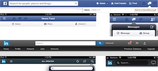
You have seen this already with Facebook and LinkedIn. Both their desktop and mobile versions utilize icon-driven menus.
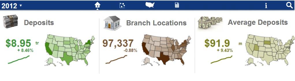
I decided to use this approach in a QlikView demo app Bardess developed in close collaboration with QlikTech. Our FDIC Summary of Deposits application, recently posted to us.demo.qlikview.com, is a powerful, easy-to-use dashboard containing bank branch deposit information downloaded from the Federal Deposit Insurance Corporation. It’s one of the first QlikView applications I’ve seen that utilizes icon-driven menus. Not only is it very visually appealing, but the iconic representation used at the top of the screen saves space for more important objects below, and also allows for easy consumption and navigation across multiple devices.
What do you think about this icon-driven approach? Would you like to learn more about how Bardess can help you improve the design and layout of your applications? Contact us today for a free consultation.